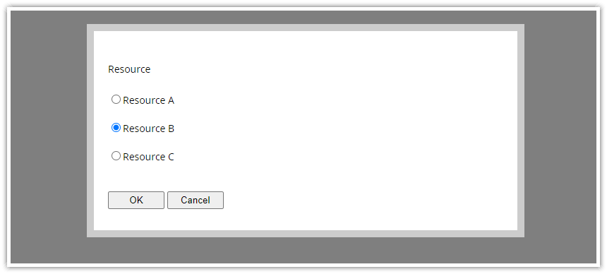
The radio field (type: "radio") displays a list of options that can be selected using a radio button.
Each option can display a list of child form fields that will be enabled if the parent option is selected.
Radio Field Properties
- type ("select") - specifies the form field type
- name (string) - the field name that will be displayed above the text box
- id (string) - the path that specifies the source/target property of the data object
- options (array) - list of options
- disabled (boolean) - makes the dropdown list field disabled (inaccessible and read-only); optional
- cssClass (string) - additional CSS class that will be applied to the form field; optional
- onValidate (function) - a callback function used to validate the field value; optional
The options array items have the following structure:
- name (string) - item name that will be displayed in the dropdown list
- id (string | number) - value associated with the item
- children (array) - a list of child fields that will be displayed indented under the parent option; optional
Example
import {Modal} from "@daypilot/modal";
// ...
async function radio() {
const resources = [
{ name: "Resource A", id: "A" },
{ name: "Resource B", id: "B" },
{ name: "Resource C", id: "C" },
];
const form = [
{
name: "Resource",
id: "resource",
options: resources,
type: "radio",
},
];
const data = {
resource: "B",
};
const modal = await Modal.form(form, data);
console.log(modal.result);
}