 DayPilot
DayPilot Modal Dialog
Flexible modal dialog library with advanced form building options and an online modal dialog designer.
Install from NPM:
npm install @daypilot/modalDisplay a modal dialog:
import {Modal} from "@daypilot/modal";

// ...

const form = [
  {name: "Name", id: "name"}
];

const data = {
  name: "John"
};

const modal = await Modal.form(form, data);
console.log(modal.result);
Online Modal Dialog Builder
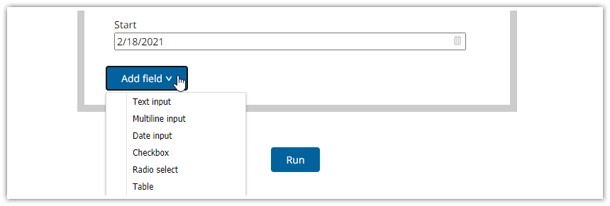
Modal Dialog Builder: Build a custom modal dialog using an online application!
Overview
Display a form in a modal dialog: you can build the form using the API or generate the code using the online builder -
form()Drop-in replacements for built-in dialogs -
alert(),confirm(),prompt()Display custom HTML in a modal dialog -
showHtml()Display another page in a modal dialog (iframe-based) -
showUrl()
Modal Dialog Features
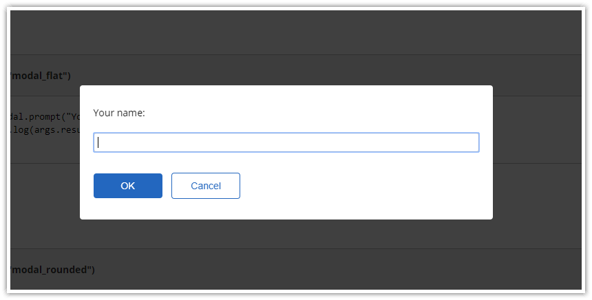
The background is masked using a semi-transparent div
The modal window is draggable
Auto-stretching width and height to fit the content
Allows styling using CSS themes
The default theme uses minimal styling to allow easy integration with your global CSS
Responsive and mobile-friendly
Dynamic Form Building
Great for prototyping
Form fields defined using a JSON object
Data defined using a JSON object
Updated data object available on close
API
Minimal typing required (defaults are used when possible)
TypeScript definitions included